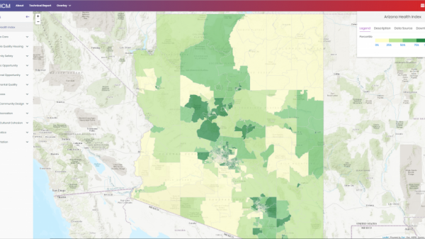
The Arizona Healthy Community Map is a joint effort of Arizona State University’s (ASU) School of Geographical Sciences and Urban Planning and Vitalyst Health Foundation to develop a statewide, publicly accessible interactive map and database of social and environmental conditions related to neighborhood health in Arizona. The purpose of the map is to promote awareness and provide information about health opportunities and disparities among diverse communities within the state.
The map conveys how communities across the state are based on a set of 39 evidence-based indicators. The map also displays overall health scores, which show how communities fare across the indicators. The indicators are grouped based on 12 dimensions that reflect the Elements of a Healthy Community model, which Vitalyst developed as part of its Live Well Arizona initiative (see livewellaz.org).
The indicators were selected based on a rigorous, three-step process that involved a review of existing 1) scholarly literature and 2) healthy community maps, and the 3) solicitation of feedback from an advisory board. The advisory board, which also gave input on the interactive map and technical report, represented leading Arizona health-related organizations, regional council of governments, local officials, and faculty at health-related research centers at state universities.
The interactive map allows users to understand the social and environmental determinants of health in the communities where they live and work and how these determinants compare to those found in other communities in the state. The map also allows users to download data of interest. The interactive map has wide-ranging applications to diverse audiences, including residents, health care providers, community groups and institutions, and local and state officials. For instance, health care providers may use the map to understand conditions potentially affecting health in the neighborhoods where their patients live and work, which may enable them to offer higher quality and more targeted care. Community groups and institutions may use the map to understand conditions in the places that they serve and advocate for policy and planning changes when necessary.
Users should keep in mind that the interactive map is the product of an imperfect process. The map is based on the best publicly accessible data that was available when the map was developed. However, one limitation is that the map only reports data for one point in time, which makes it difficult for users to understand the trajectories of communities of interest. Users should keep this and other limitations in mind when engaging with the map. Future updates of the map should attempt to overcome these limitations.
More information about the map, including its process of development, uses, and indicators, is available in the technical report.
ASU Project Staff:
Dr. Deirdre Pfeiffer, Project Lead ([email protected] (link sends e-mail))
Dr. Daoqin Tong, Project Co-Lead ([email protected] (link sends e-mail))
Dr. Wangshu Mu, Research Associate ([email protected] (link sends e-mail))
Elizabeth Van Horn, Research Assistant ([email protected] (link sends e-mail))
Vitalyst Project Staff:
Jon Ford ([email protected] (link sends e-mail))
Advisory Board:
Rosanne Albright, Anubhav Bagley, Julie Baldwin, Terry Benelli, Sonia Charry, Justin Chase, Joselyn Cousins, Daniel Derkson, CJ Hager, Dave Laney, William Riley, George Runger, and Serena Unrein